

Create A Design System with Storybook, Typescript, and Next.js
Design systems are a scalable solution to unify an organization's brand between designers, engineers, and management to deliver a consistent user experience to the end-user. In this article, you'll learn the fundamentals to create a design system with Storybook, an open source tool for frontend development. The article will cover the reasoning behind design systems, creating your own, setting up visual testing, and deploying your system with Chromatic.
Note: you can get the full repo code to follow along or clone
Why Need a Design System?
With large-scale teams and organizations, UI component management for applications can become increasingly messy if not structured well. Large organizations have to maintain several applications across different devices and for different goals. Companies with mature codebases may need many engineer and design teams to maintain their applications. With so many people involved with the UI, there can be lots of headaches and inconsistencies across all products. Miscommunication between designers and developers stalls progress, developers across different engineer teams recreate the same component or don't understand how a previously made component should work. That's where design systems come to play, to make UI development collaborative, consistent, and manageable.
What is Storybook?
Storybook is an open source frontend tool that isolates UI development into manageable pieces. By using Storybook, creating UI components is easier with component testing and auto-generated documentation. The tool also has many addon features that make development a breeze by checking accessibility or integrating designs directly from Figma/Adobe DX. To top off their features, the components can be "snap-shot" deployed to Chromatic to be shared across all stakeholders.
What is Chromatic?
Chromatic is an automation tool designed to help iterate the UI design process to ease development and feedback among developers, designers, and other stakeholders. Chromatic is simple to integrate with your Storybook development and your CI/CD pipeline. It automates the deployment of your Storybook when you push changes to your repository. By auto-publishing when code changes, designers and stakeholders can review the UI to make sure it looks correct. Once it's approved, then the code is finally released.
Building Our Own Design System
To get started with our own design system, we'll make a small React/Typescript component library to be used in a Next.js web app. This article will only do an overview of how to set up Storybook with some example components. This tutorial covers the component piece for design systems and does not cover other areas such as typography, brand colors, or content tone. Once you know these fundamental steps, you can extend your work to include such areas or keep it close to a component library.
Note: Before committing to a design system for a project, go over the tradeoffs of using component libraries like BlumaCSS or Material UI. Depending on what you are working on, the time constraints, and the limited budget, you may not want to start off with a fully-fledged design system.
Starting Our Project
Let's start off with making a new directory called storybook-tutorial and open it in your code editor (I'm using VS studio code w/ Bash).
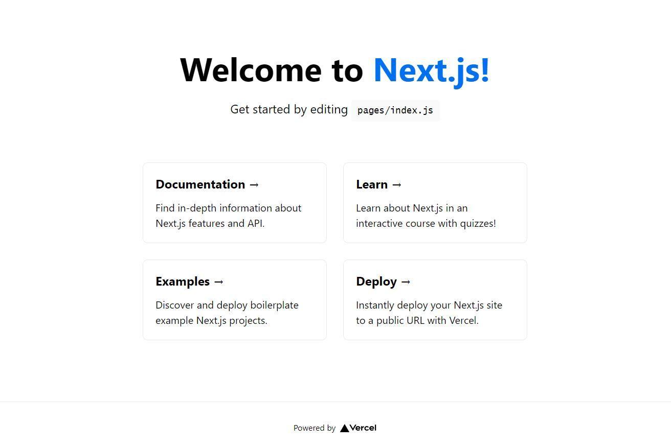
Next, start up the new Next.js project with Typescript and run the code at localhost:3000:
Once that's complete, you can see the code working just fine and now you can dive into Storybook!
Adding Storybook
Let's stop running your Next.js application so you can add Storybook with the following command in the terminal:
This command with spin up a new Storybook project with example components and tests called stories based on what type of code is in the project directory (Svelte, Angular, React, Vue, etc). Storybook will detect your React/Typescript project and make components that match.
Run Storybook with this command:
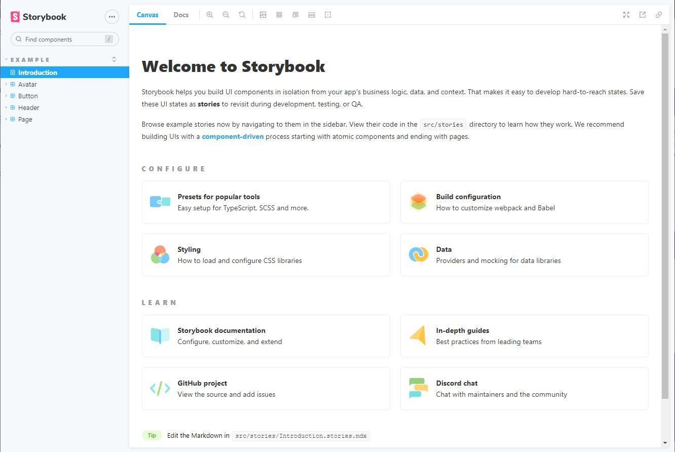
When Storybook runs, you get an excellent interface in the preceding image. On the left side navigation, you can explore different components and their tests called stories. On the right side, you can view what the components look like in action and also toggle between viewing the component and also its automated docs. To get a better sense of how this works, you can make a new component to test in Storybook.
Creating Components
Let's create an Avatar component to see how Storybook can make UI development simpler. Make a new Avatar.tsx in the stories folder with the following code:
Our Avatar component can take in a name, an image object with an src as a string, shape, and size. Notice how each of these props has comments explaining how they work in the interface definition (this comes into play later).
CSS is hard, so here's a stylesheet with BEM to make the Avatar component look nice:
Now for the final piece, set up component testing through *.stories.* files. These types of files allow you to test components based on the different states defined in a component's props.
Let's start off by defining our Avatar.stories.tsx file. Inside it, import the component and define the component story.
Then create a component template that will bind to different stories.
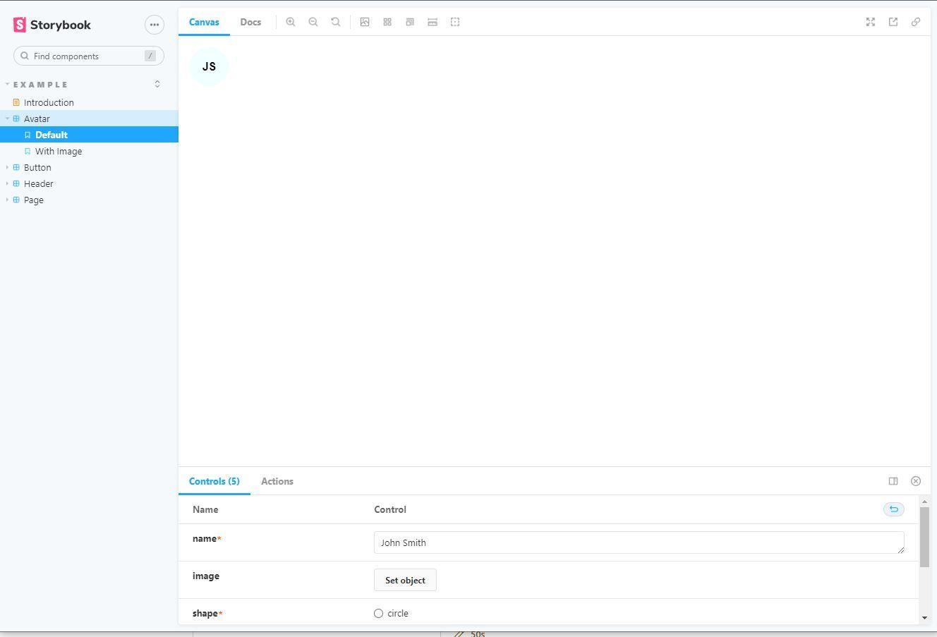
You define stories by binding the component template to different scenarios. To get a gist of this power of stories, make two stories (a default and one with an image) that can be customized by modifying their args based on different prop values:
After making these files, you can test the Avatar component. In the following image, the default Avatar story appears in the Storybook tool and can toggle between the stories.
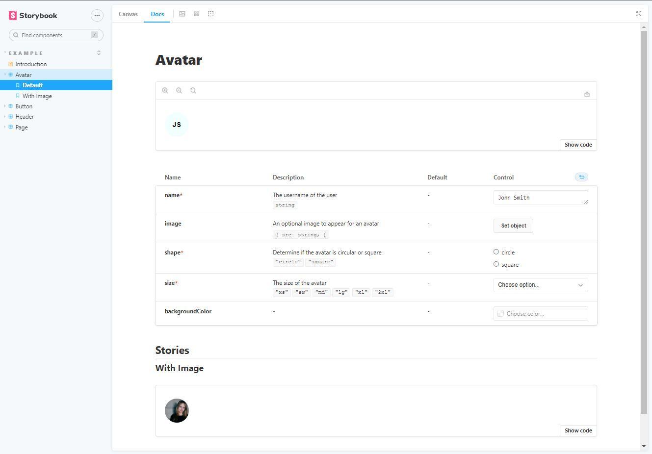
To view component documentation, you can move from the Canvas view to the Docs view. In this view, you get documentation generated from comments in the component (see? It would come back) as well as the different stories.
You now understand how to make components, test them, and create documentation all through just Storybook 🤯. With these skills, you can develop your own design system quickly to ensure they meet all our test cases and are documented. But you can go further and deploy this design system so your collaborators/stakeholders can approve of your work!
Deploy Design System with Chromatic
Chromatic is the maintainer of Storybook, so their service has a seamless integration to publish our Storybook.
Let's go make our repo linked to a GitHub account before we continue using GitHub Desktop, their CLI, website, or just through git.
After that, we should also make a Chromatic account and use our GitHub to sign up.
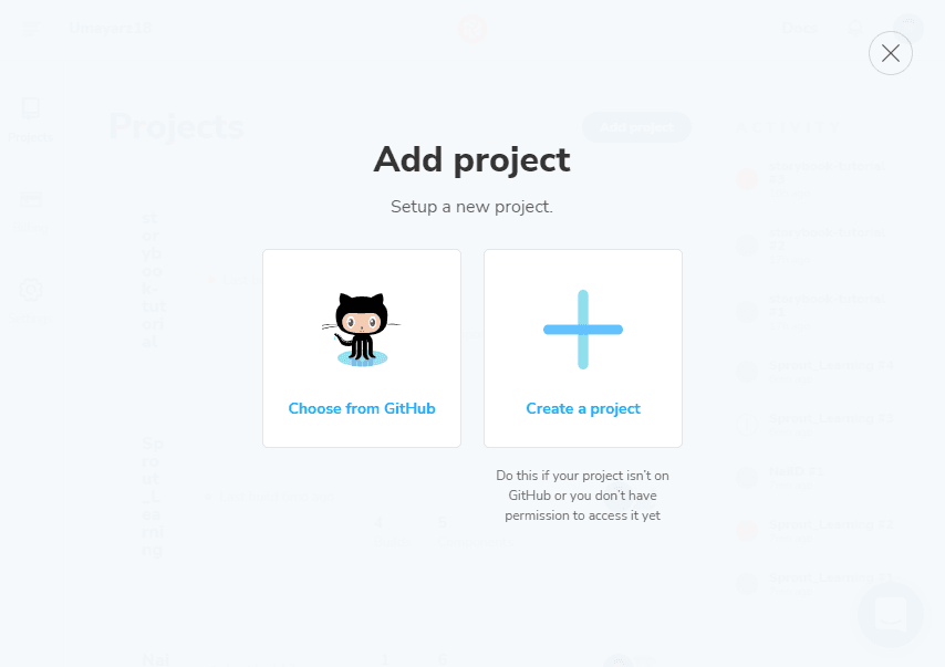
Then let's add our project to Chromatic.
Once that's set up, let's add Chromatic as a dev dependency:
Let's commit this change first before creating a baseline:
A baseline is a snapshot of our component stories that will be measured against any new changes that get made. We can set this baseline through this command and replacing <project-token> with whatever you find for your project in the Chromatic dashboard:
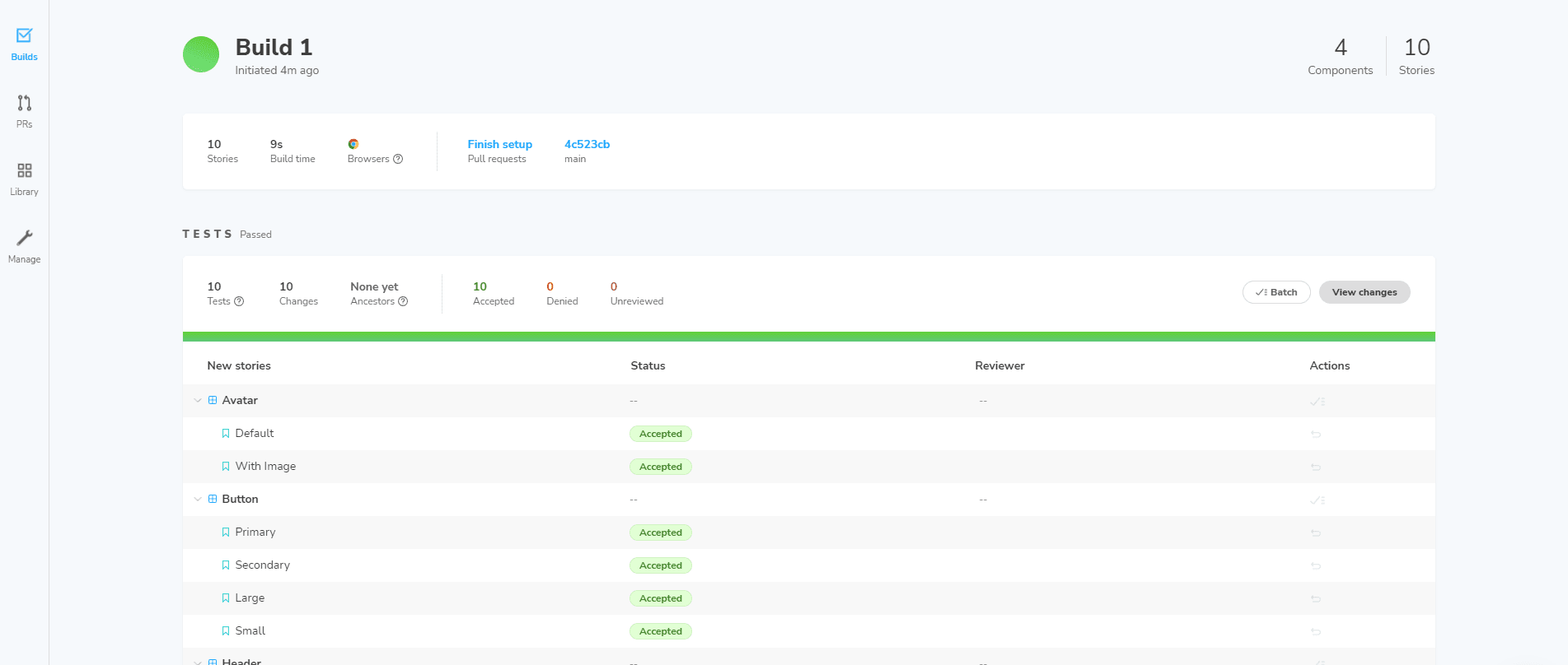
Once the command is complete, return back to Chromatic. There will be builds for your repo that match directly with your local Storybook.
Now you can run that command every time you're ready to publish. However, you can also (yeah there's more) automate publishing to Chromatic when new code is pushed.
Automate Chromatic with GitHub Actions
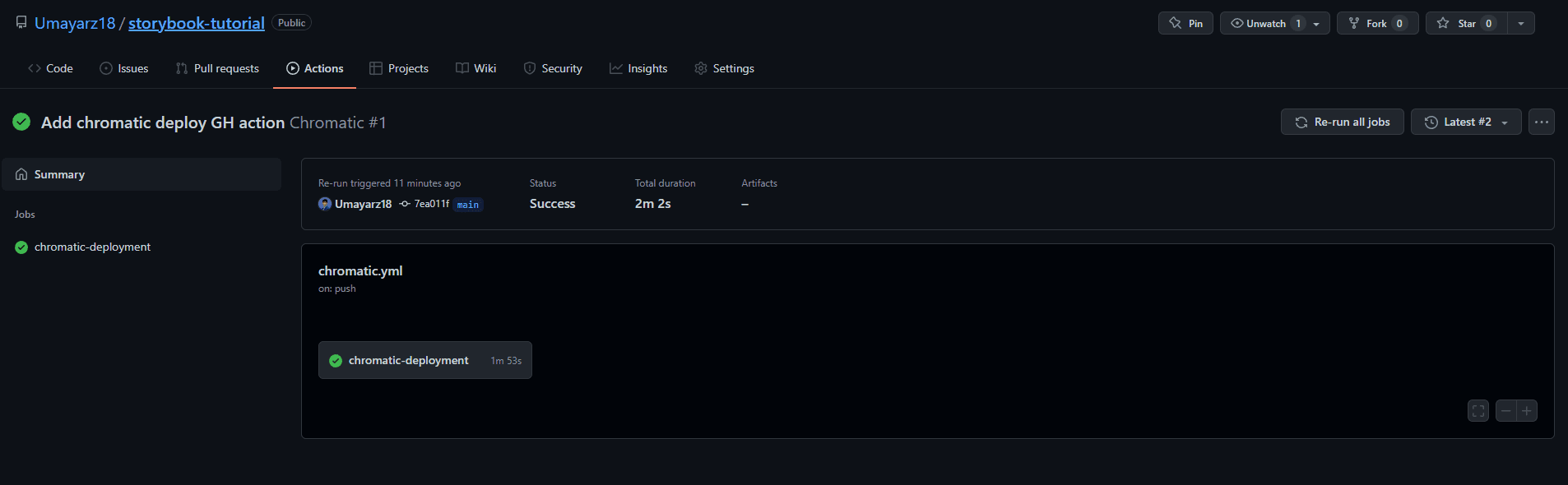
By using GitHub Actions, you can streamline UI development even more. You can ensure that every time new code is pushed to your repo, changes are published to Chromatic. This is effective when making pull requests as reviews on Chromatic are required before merges, reinforcing UI alignment between teams before release. Although this tutorial involves using GitHub Actions and requires your project to be a GitHub repository, there are other integrations available.
Create a .github folder in your root directory with a workflows folder. This will house the Chromatic deploy file called chromatic.yml:
Use the following code inside chromatic.yml to deploy your Storybook to Chromatic any time new code is pushed:
In the preceding code file, you'll notice you need some secrets to make this work. You won't need to worry about secrets.GITHUB_TOKEN, but you will need to create a new GitHub secret called CHROMATIC_PROJECT_TOKEN. Add the project token and save it to your repo.
Go ahead and commit these changes to see the automation at work:
Sweet🍦🍦! Now Chromatic will publish automatically. You can try making a pull request to see how Chromatic brings other stakeholders to review UI changes and make UI feedback easy.
Make a new branch to place some UI changes:
Change the background color for the Avatar component in avatar.css:
Commit those changes and push them to the branch:
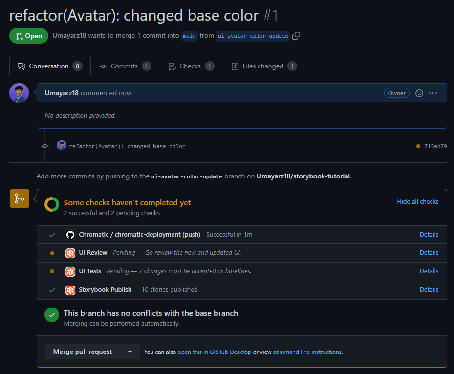
Now create a Pull Request on GitHub (below code uses the GitHub CLI, choose whichever way you like 😀):
Once the pull request is made, GitHub deploys your Storybook and requires checks. Before a merge can be made, UI review and UI tests need to happen.
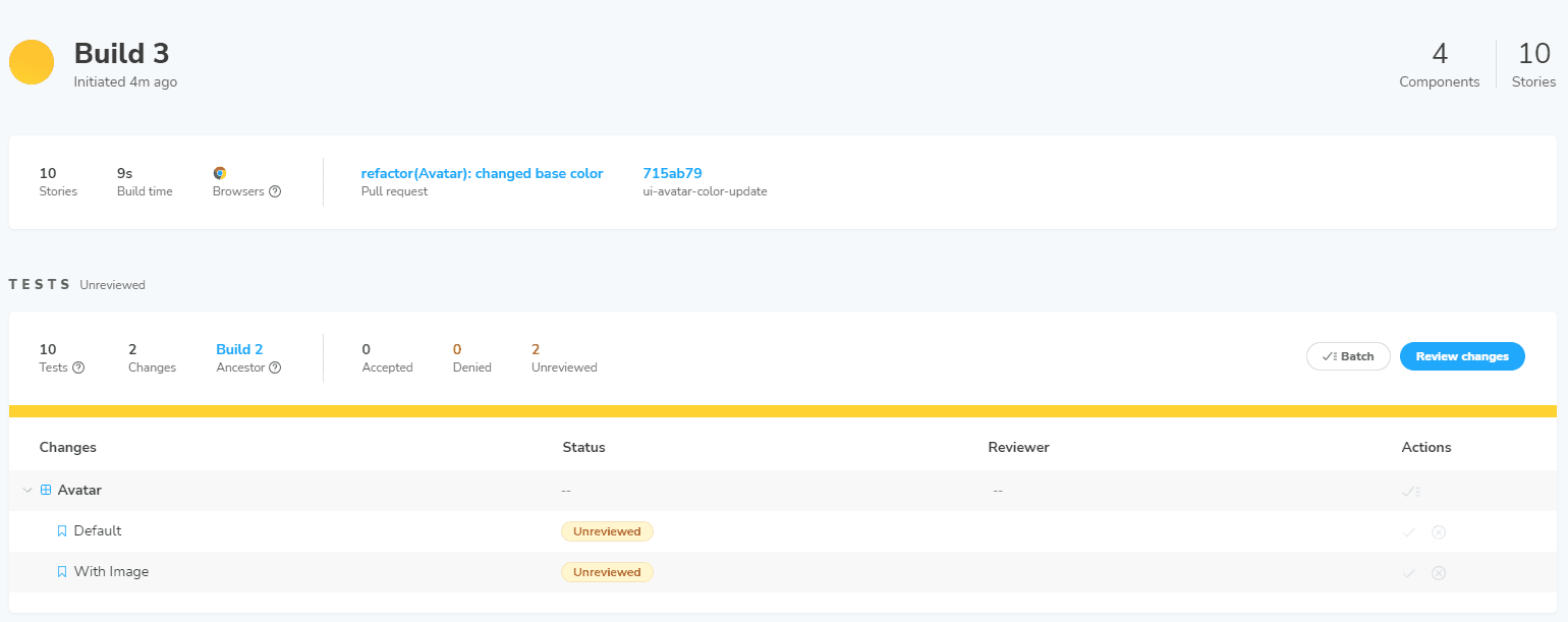
UI tests can be found in the latest build on Chromatic. You can go through and review each change.
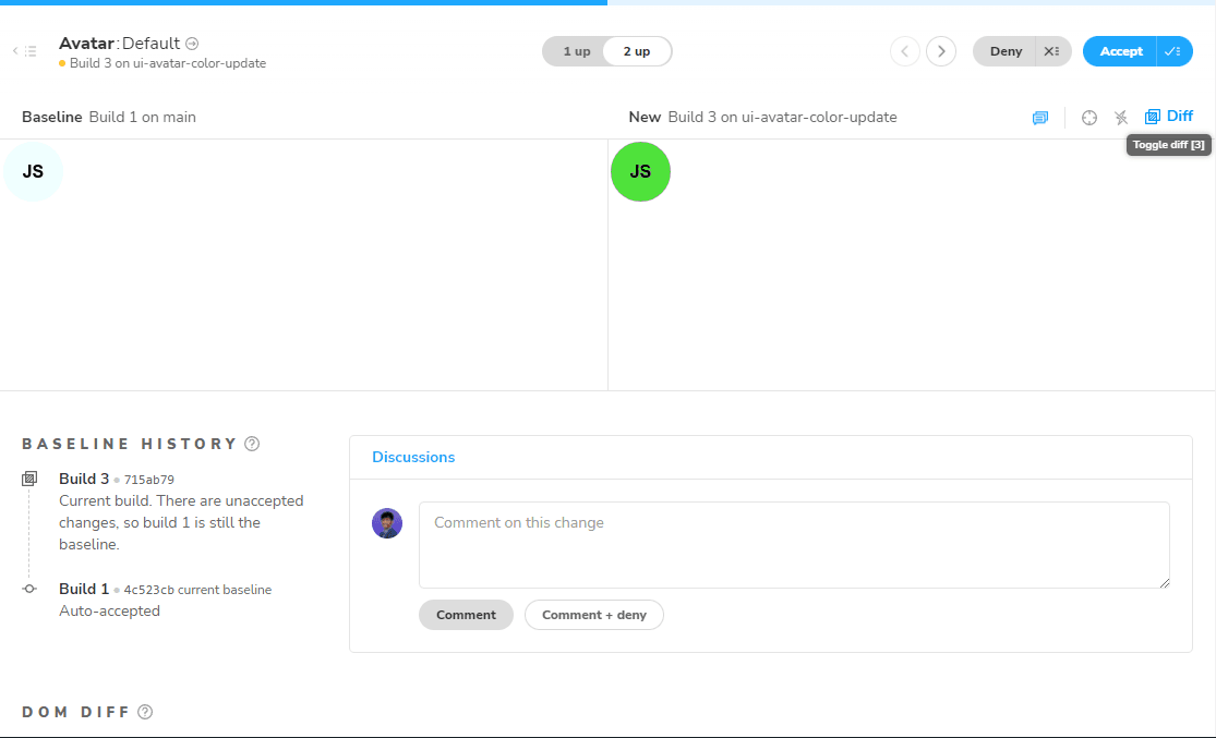
When reviewing changes on Chromatic, you can highlight the visual changes so easily and make comments about the changes. This interaction allows non-coders to look at your work and make suggestions or approve.
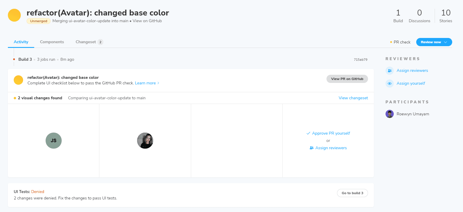
For UI review, you can assign yourself or others to check the UI tests.
These features from Chromatic involve non-developers directly with the UI development in Storybook and make communication and iteration simpler. These two technologies paired together (as it should be 😎😎) make developing a design system collaborative, transparent, and automated.
Wrapping Up
Wow, congrats on making it this far on this (long🐴) tutorial about starting your own design system with Storybook. With only this read, you have learned the fundamentals to create, test, automate, and communicate easily in the UI development process. There's much more out there for you to learn and improve your development of design systems in Storybook:
- Integrate other Storybook Addons made by the community to improve your workflows.
- Learn more about Storybook and design systems from their well-researched guides and tutorials.
- Get involved with the Storybook community and Open Source project to contribute or get your questions answered
I hope this article gives you enough to effectively make a design system for your next project. Happy Coding 🖥️🖱️!